NET HEALTH® pointright
Better Outcomes Powered by
Post-Acute Analytics
First in post-acute analytics and trusted partner for over 25 years
Clients see an average increase of
$11
in Medicare Part A per diem rate

Improve quality outcomes and succeed in value-based care with powerful insights to identify resident risk, determine care planning priorities, and manage facility performance from Net Health PointRight.
The Insights Needed to Successfully Manage Skilled Nursing
Increase Compliant Reimbursements
- Get reimbursed by accurately capturing complete and consistent clinical data
- Maintain cash flow by avoiding reimbursement delays due to coding inconsistencies
- Understand factors impacting your Medicare or Medicaid reimbursement rates
Users see an annual increase of as much as $300K in PDPM per diem .
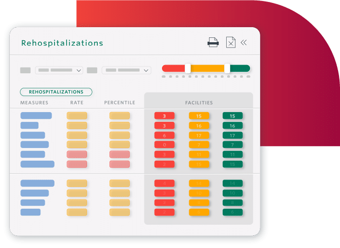
Decrease Readmissions and Hospitalizations
- Safely transition residents to the next level of care with appropriate discharge planning
- Identify residents nearing end-of-life to safely transition to palliative care
- Prevent readmissions by understanding what drives them
SNFs in Cambridge, MA achieved a 25% reduction in 30-day readmissions.
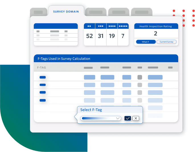
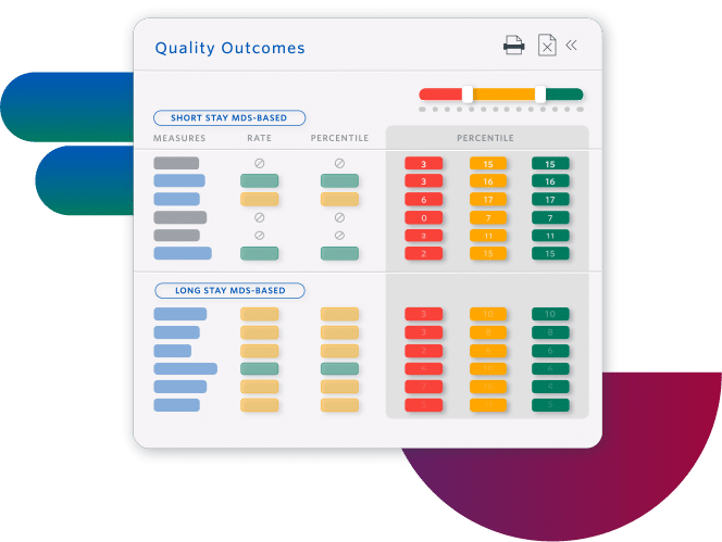
Improve Quality Measures and Facility Rating
- Increase referrals by understanding how to improve your Five-Star rating
- Prevent adverse events by planning individualized care interventions, identifying specific resident-level risk factors
- Improve facility performance with insights at all levels, from enterprise to individual residents
Sierra Health Care increased its average rating from 1 to 5 stars.
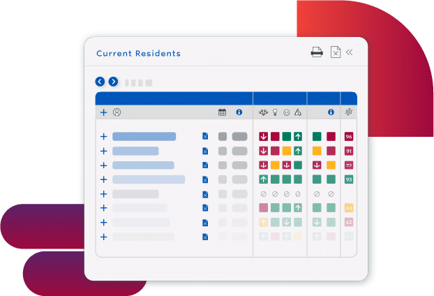
Use Staff Resources More Efficiently
- Eliminate rework with a proactive process that fits into existing workflows
- Prioritize staff resources by understanding how staffing impacts outcomes
- Determine better care plans with the connections and patterns that advanced AI finds in complex clinical data
FAQ
PointRight Post-Acute
Analytics from Net Health
Harness the Power of
Post-Acute Analytics
Want to see how Skilled Nursing Facilities are increasing revenue while simultaneously reducing readmissions?
Schedule a demo today.
Book a free one-on-one demo and discover why more than 23,000 facilities rely on Net Health
"*" indicates required fields